Welcome to #PowerUp season 4! 🔋
If you’re starting to think about next season’s kit already and you’re fancying something a little bit different from your run-of-the-mill teamwear shirt, then you’re in the right place.
We’ve been doing #PowerUp for several years now and it’s fair to say we’ve perfected the process, even if we say so ourselves.
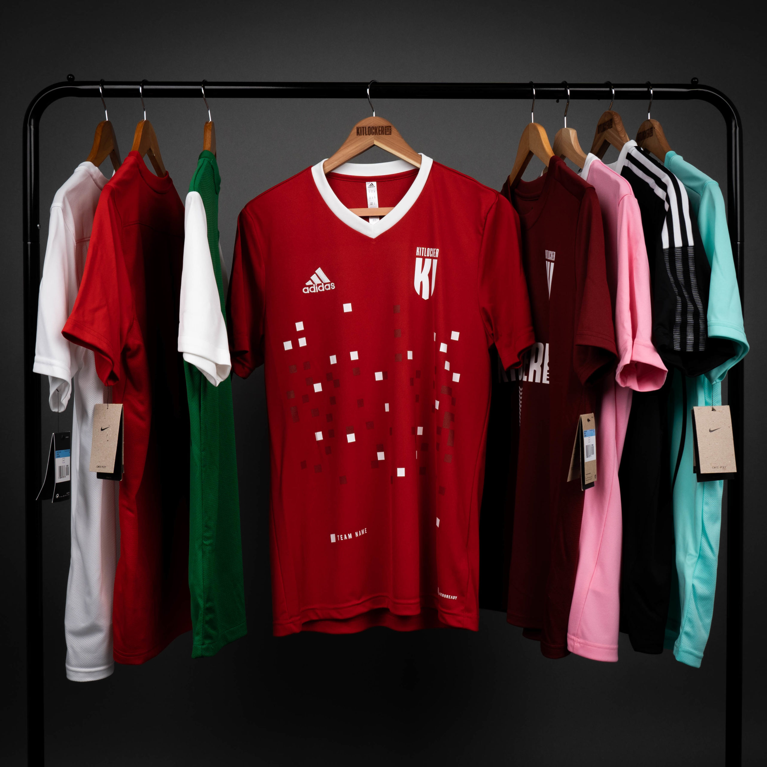
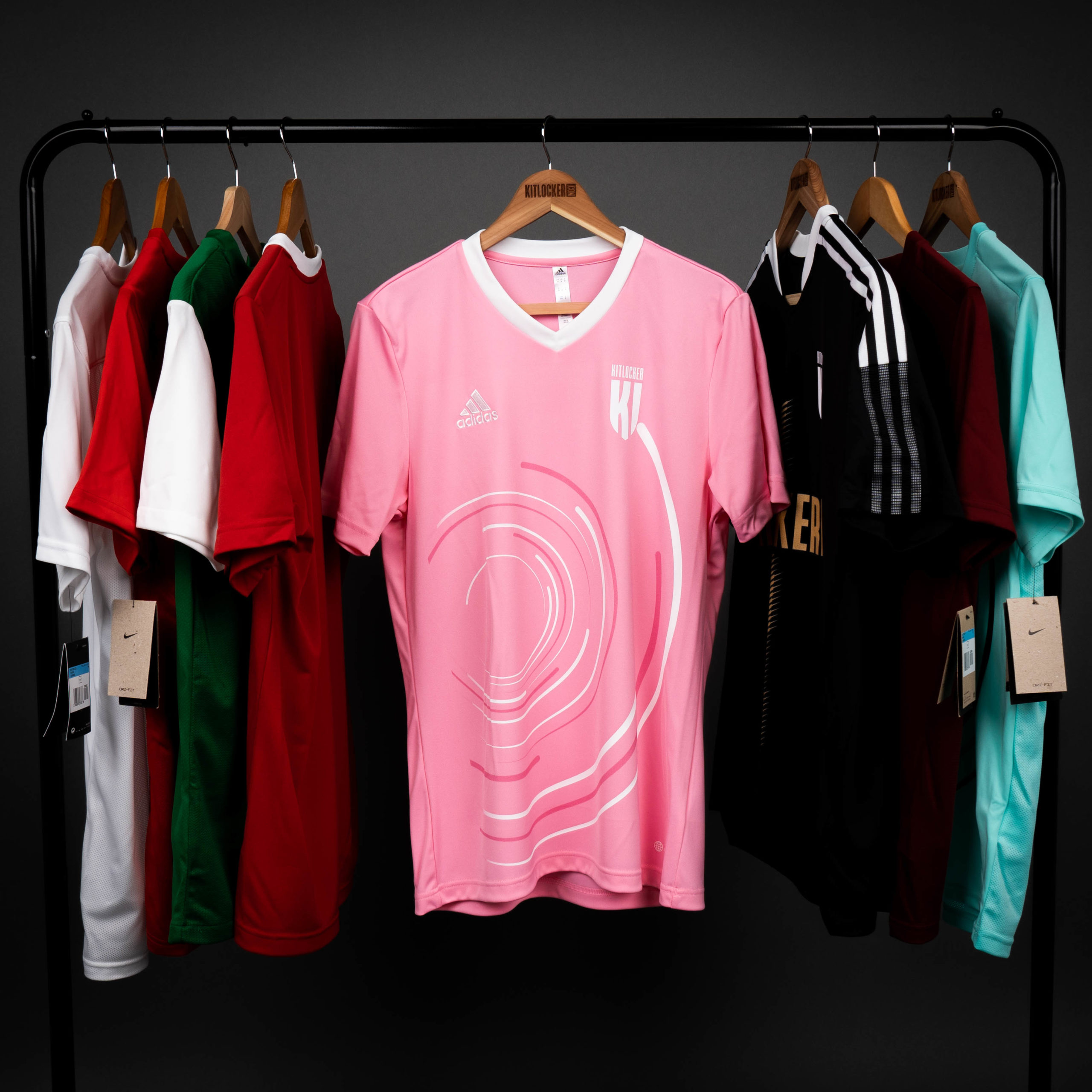
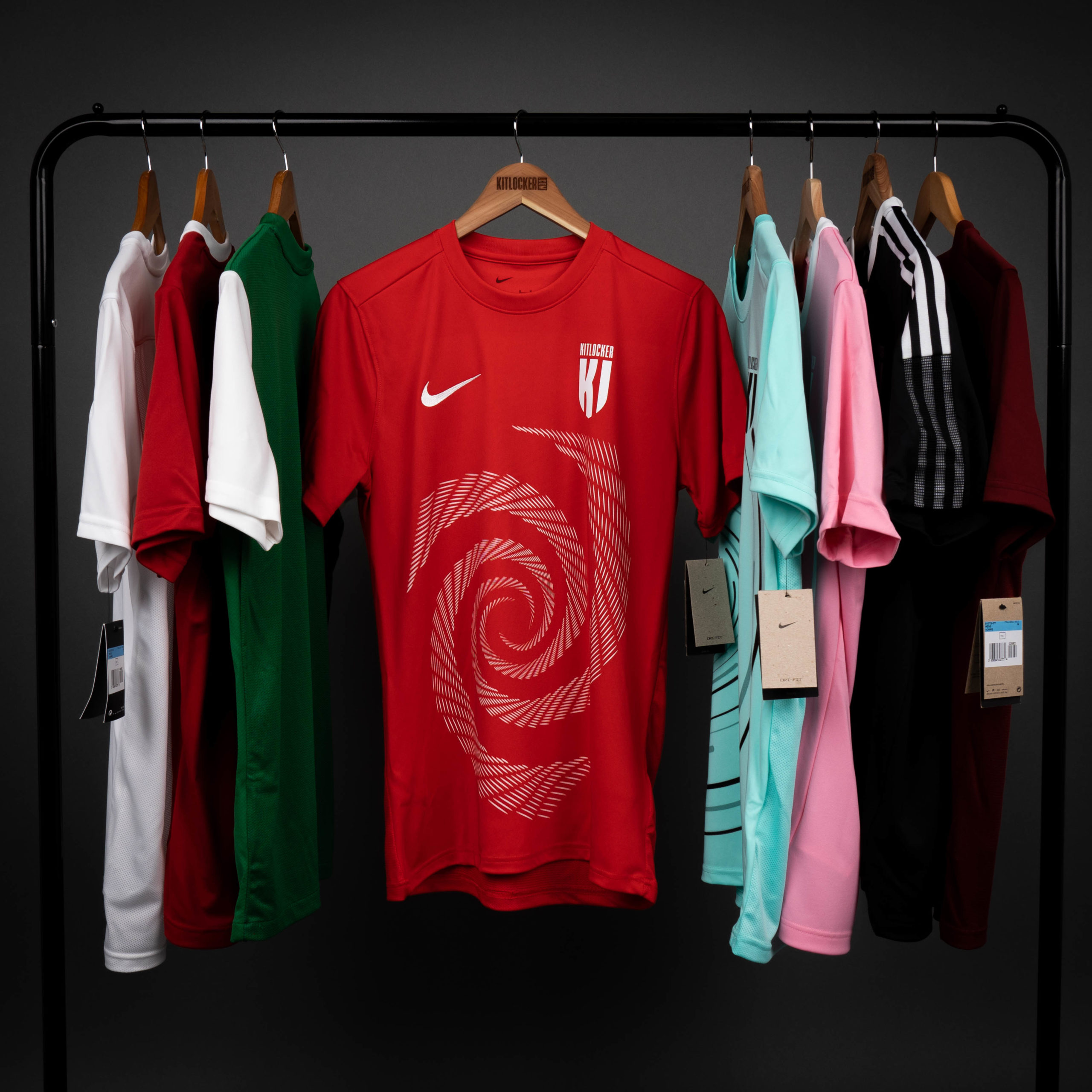
Our creative juices have been flowing all winter and the result is 6 stunning new ready-to-go designs. All of which, can be printed onto any Nike, adidas, Puma or Umbro match kit.
Here they are ⬇️
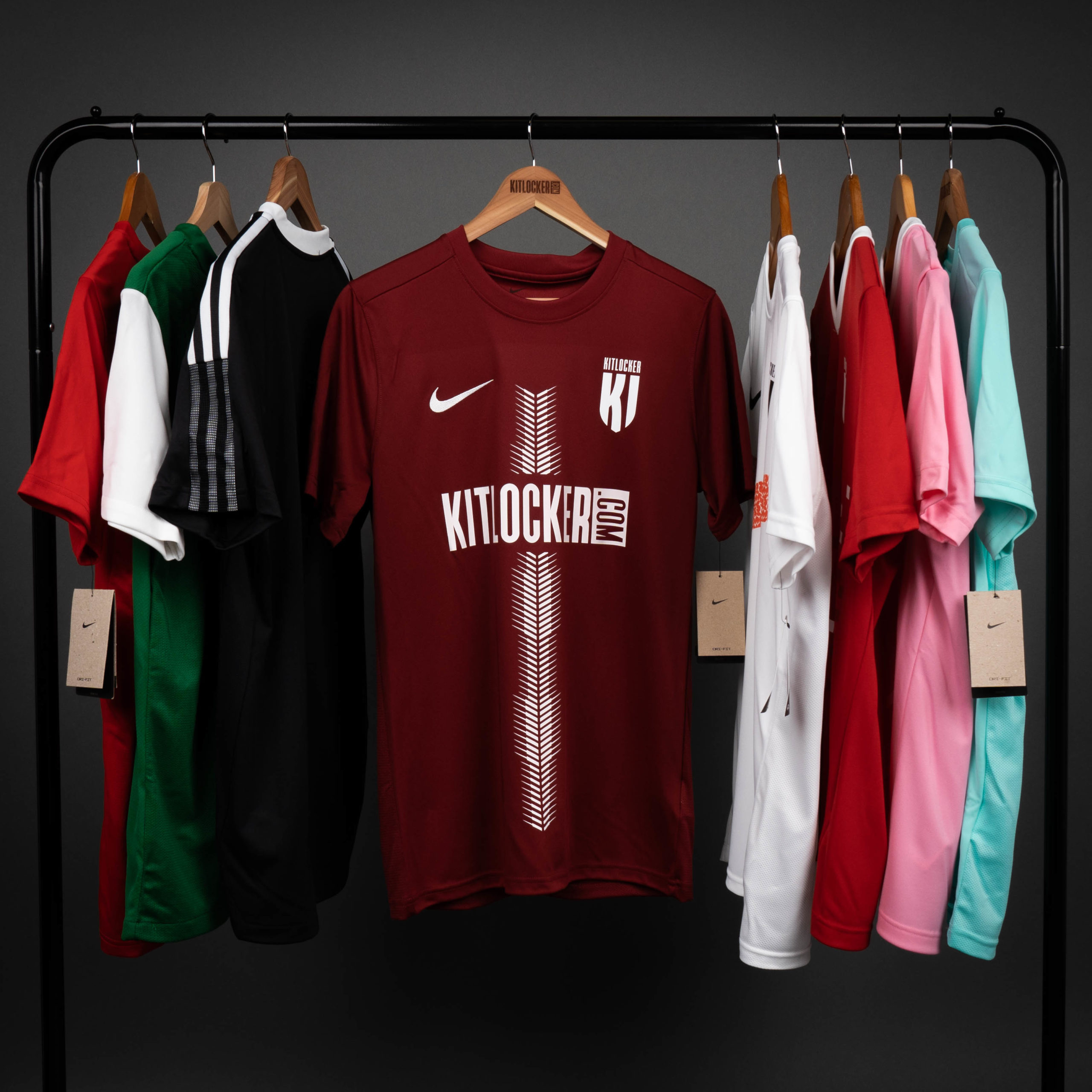
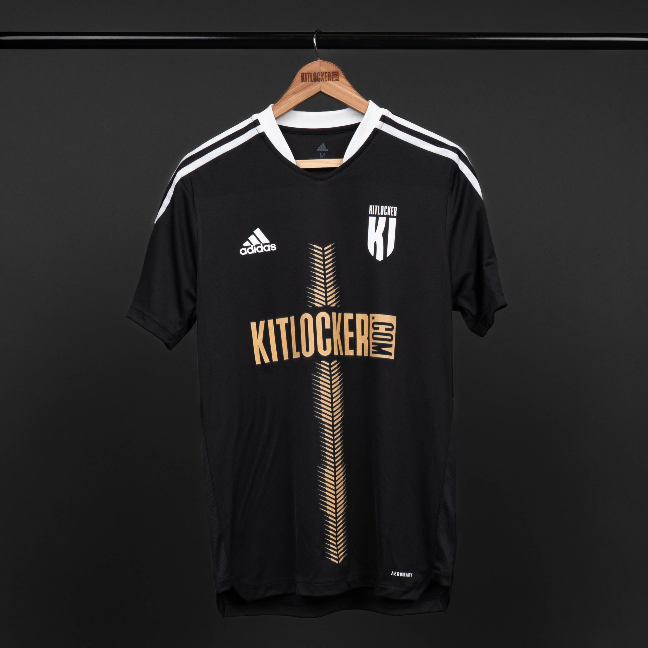
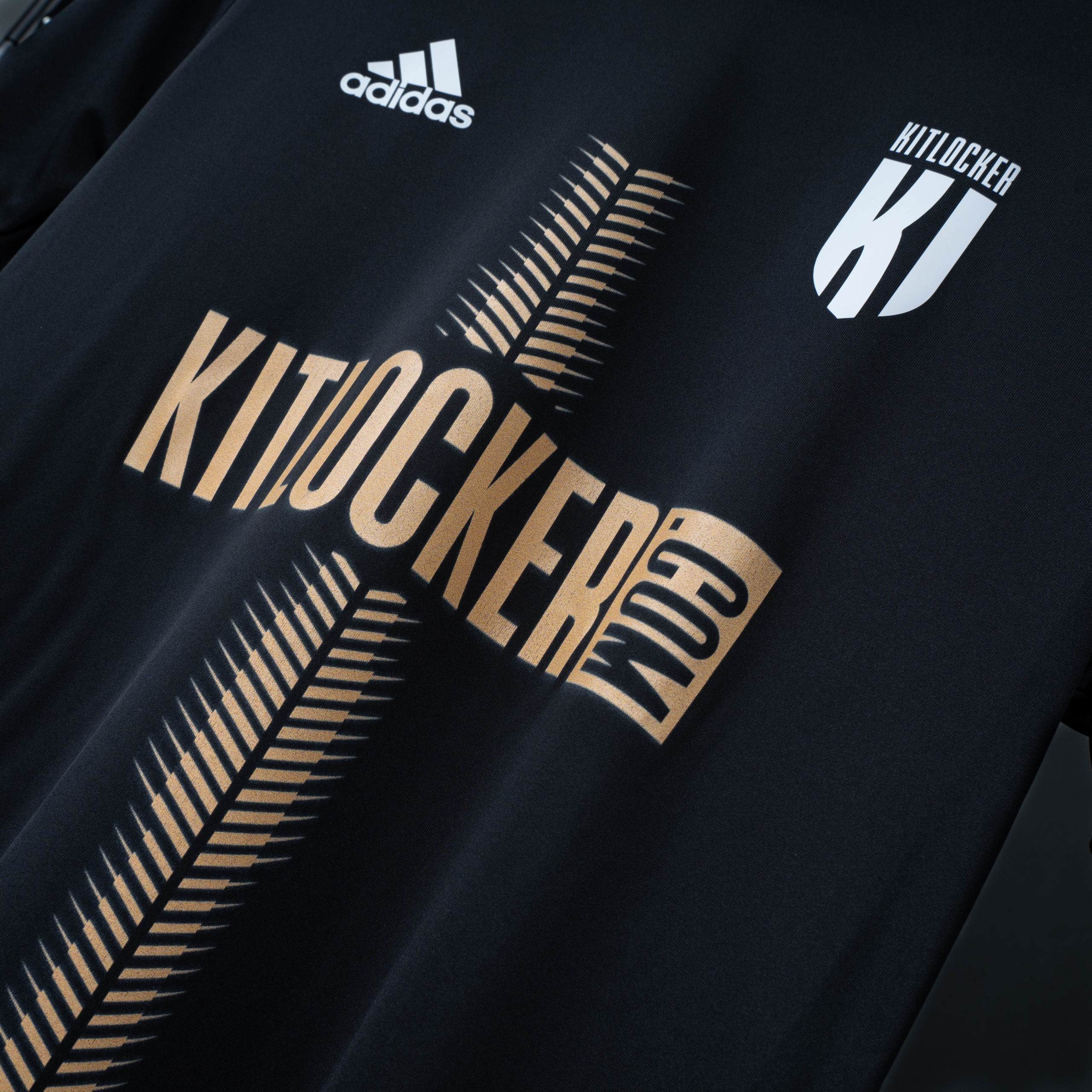
DRILL 👷
Some of the most popular designs over the last few years have featured a central beam. So we thought it’d make sense to include one in this new group of #PowerUps.
The design itself gives us thoughts of nails or drill bits, hence the name. Hopefully this kit will inspire your team to construct a winning performance. It also, like all of our designs can be adapted in order to integrate any sponsor logos.
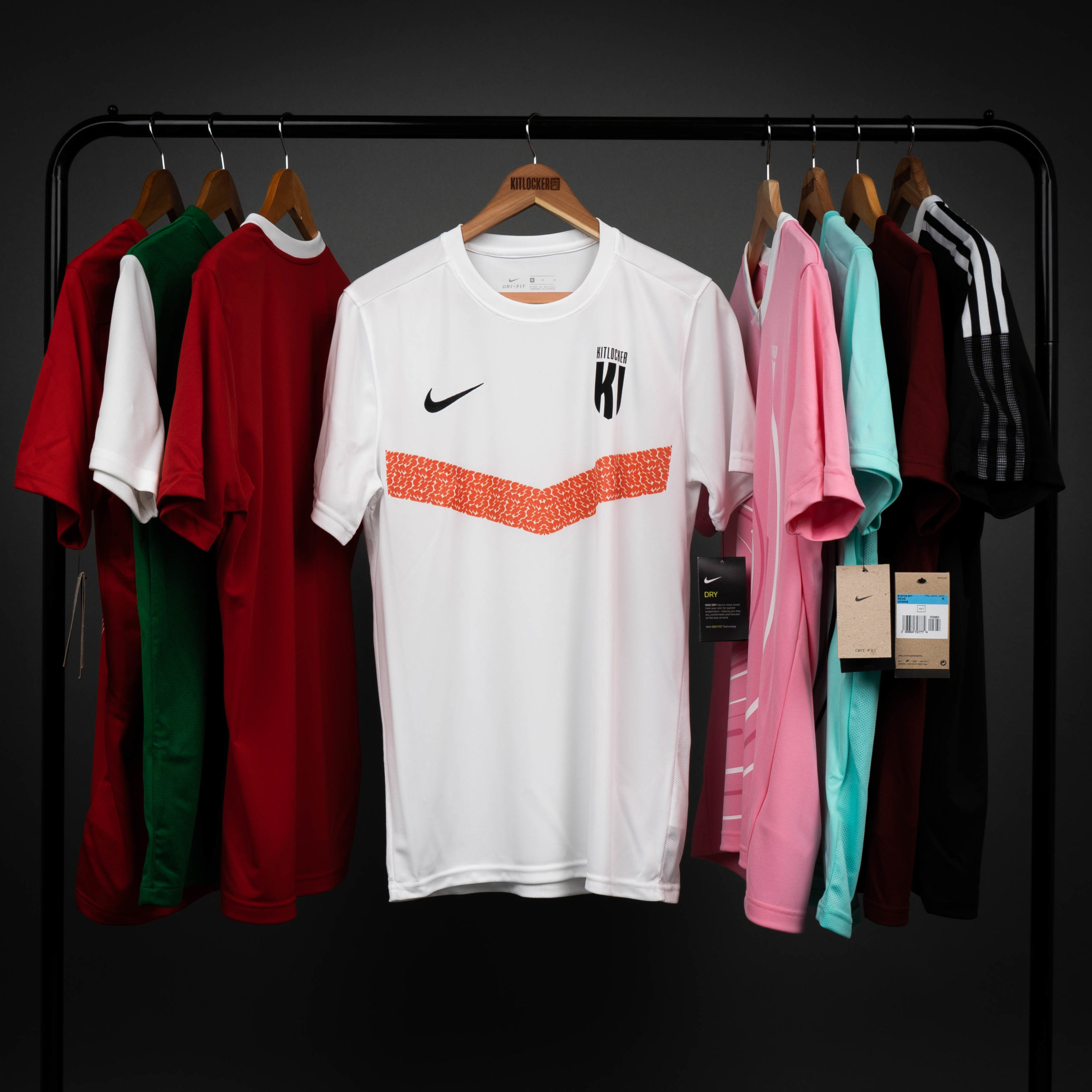
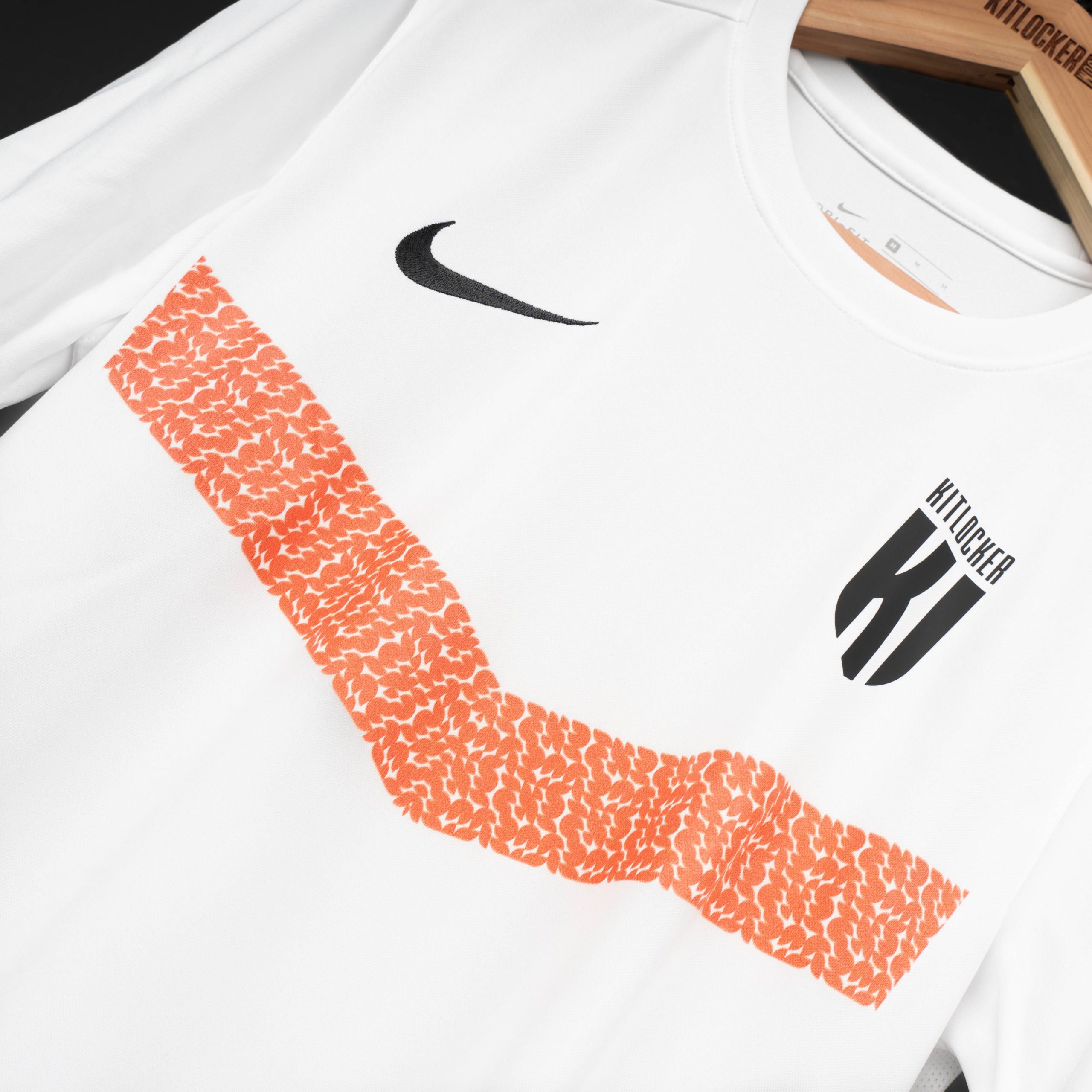
DIRECTION 🔰
Chevrons have also been very popular over the years. The band underneath the team and manufacturer logos always looks good, breaks up the shirt and immediately makes it look bespoke.
Look a little closer and you’ll see that it’s more intricate than just a solid stripe. The chevron is made up of loads of small leaf-like shapes.

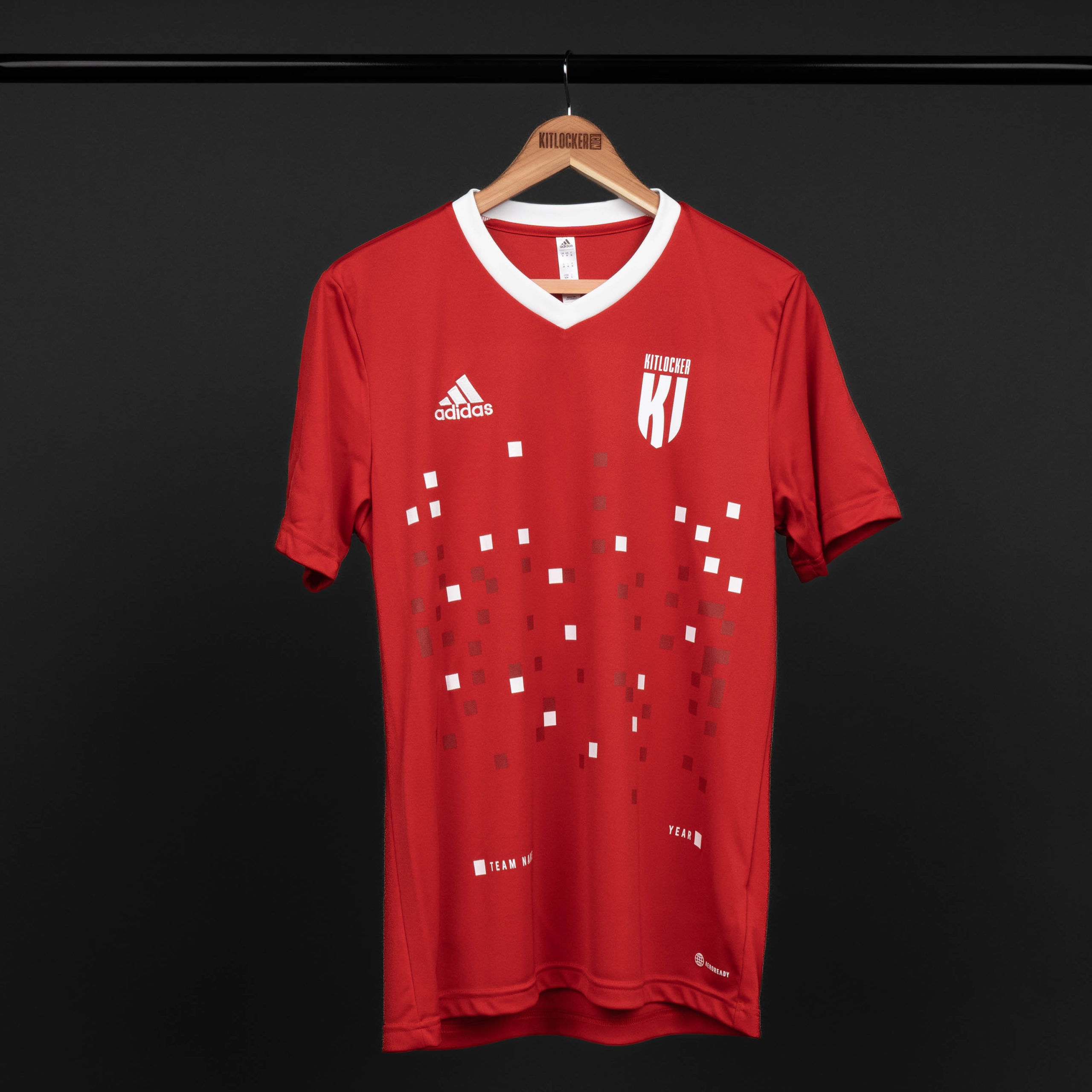
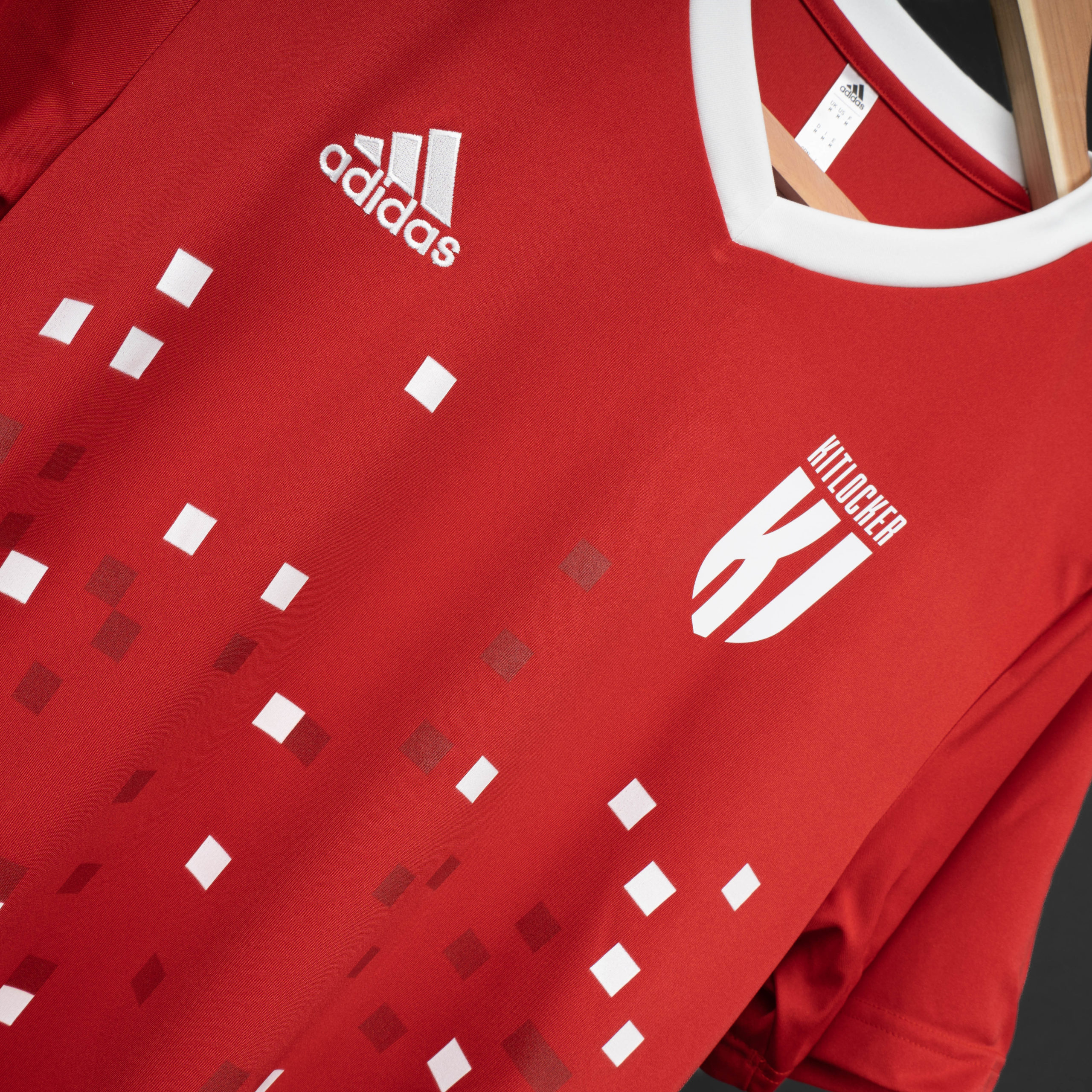
STATIC 📺
This one is a more subtle design. It features a scattering of squares across the front of the shirt which again, makes any shirt look like a unique piece.
It also offers the flexibility to add dashes of colour to the shirt. The individual squares are completely customisable.
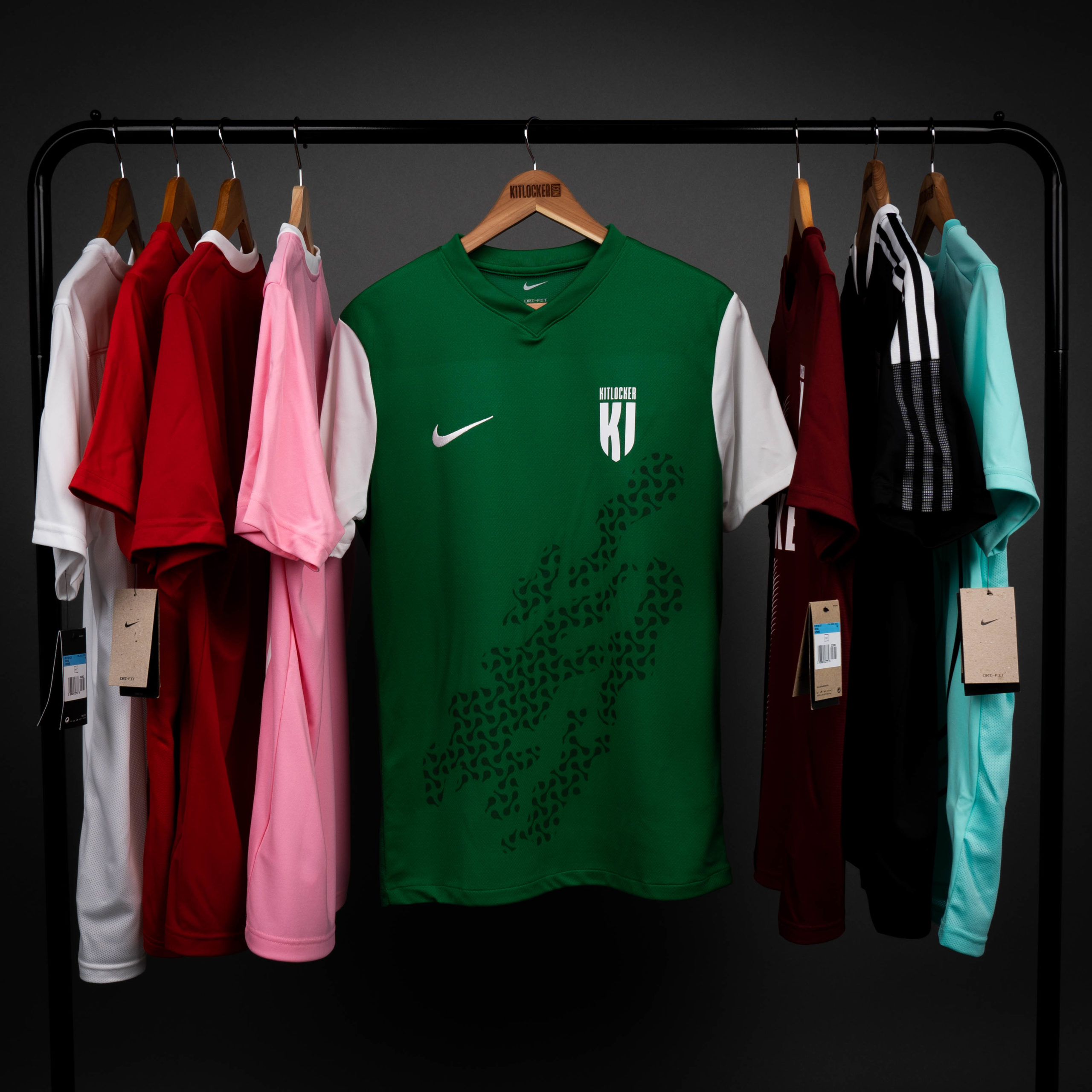
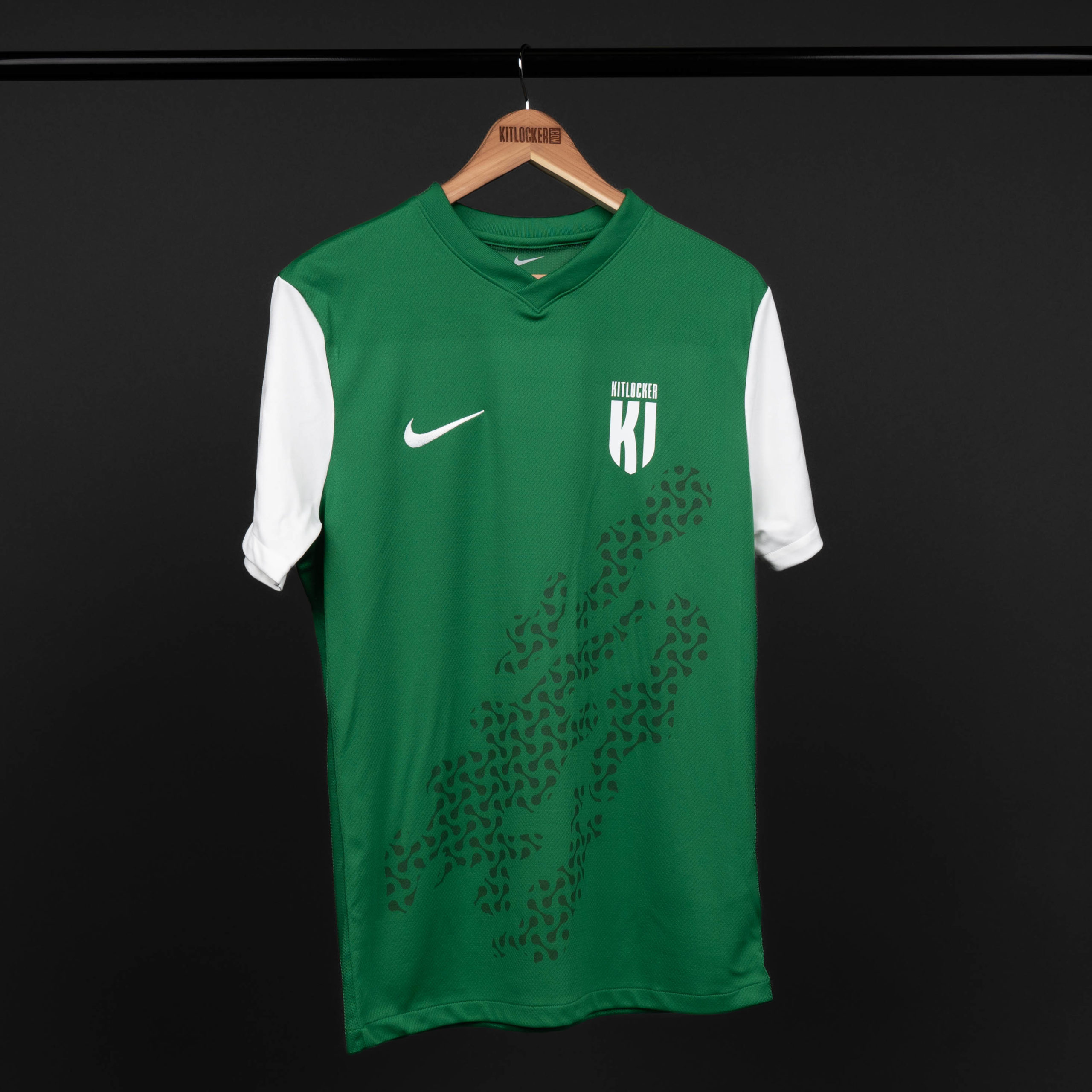
RIPPLE 💧
We’re really excited about this one and we reckon it’s going to go down well this year.
It’s big, it’s beautiful and it’s fully customisable. Add any colour you like to create your club’s identity. Whichever way you take it, you’ll be making waves in your league this season.
GLITCH ❇️
This one is another more subtle design but that doesn’t limit it’s impact.
To be honest we’ve struggled to come up with a description for this one. Trust us, we’ve tried. But at the end of the day, it just looks good and would suit any plain kit in any colour.

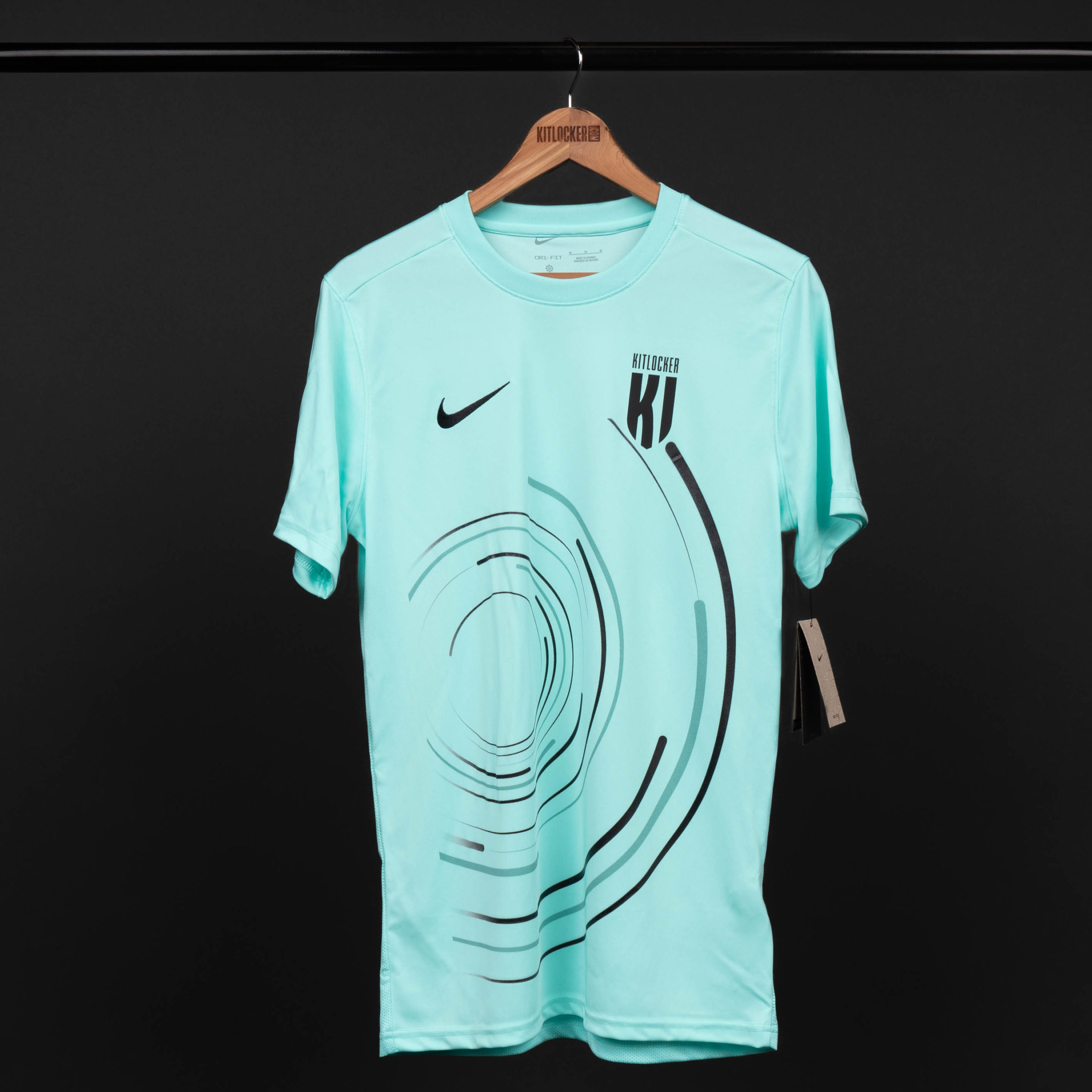
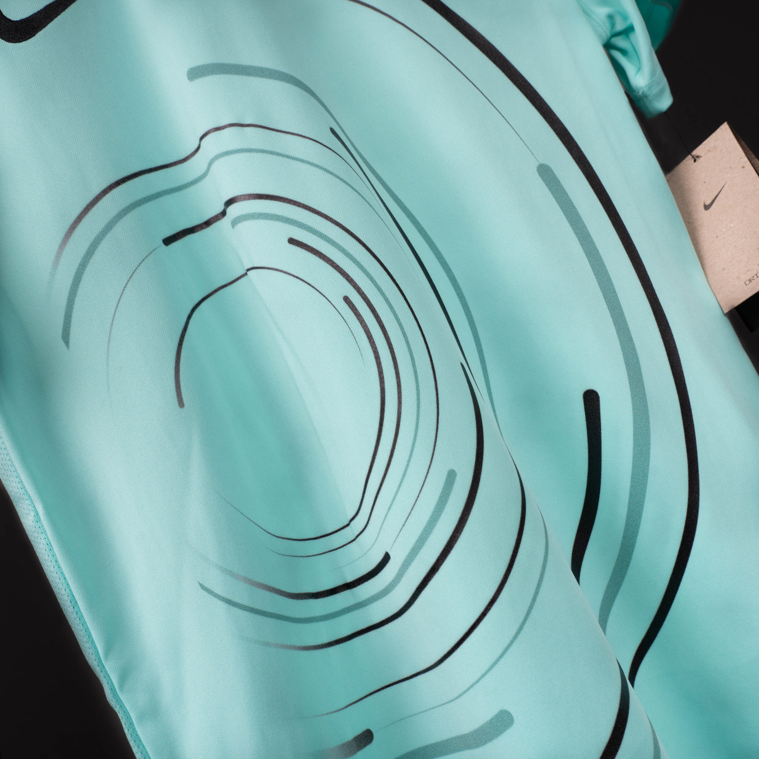
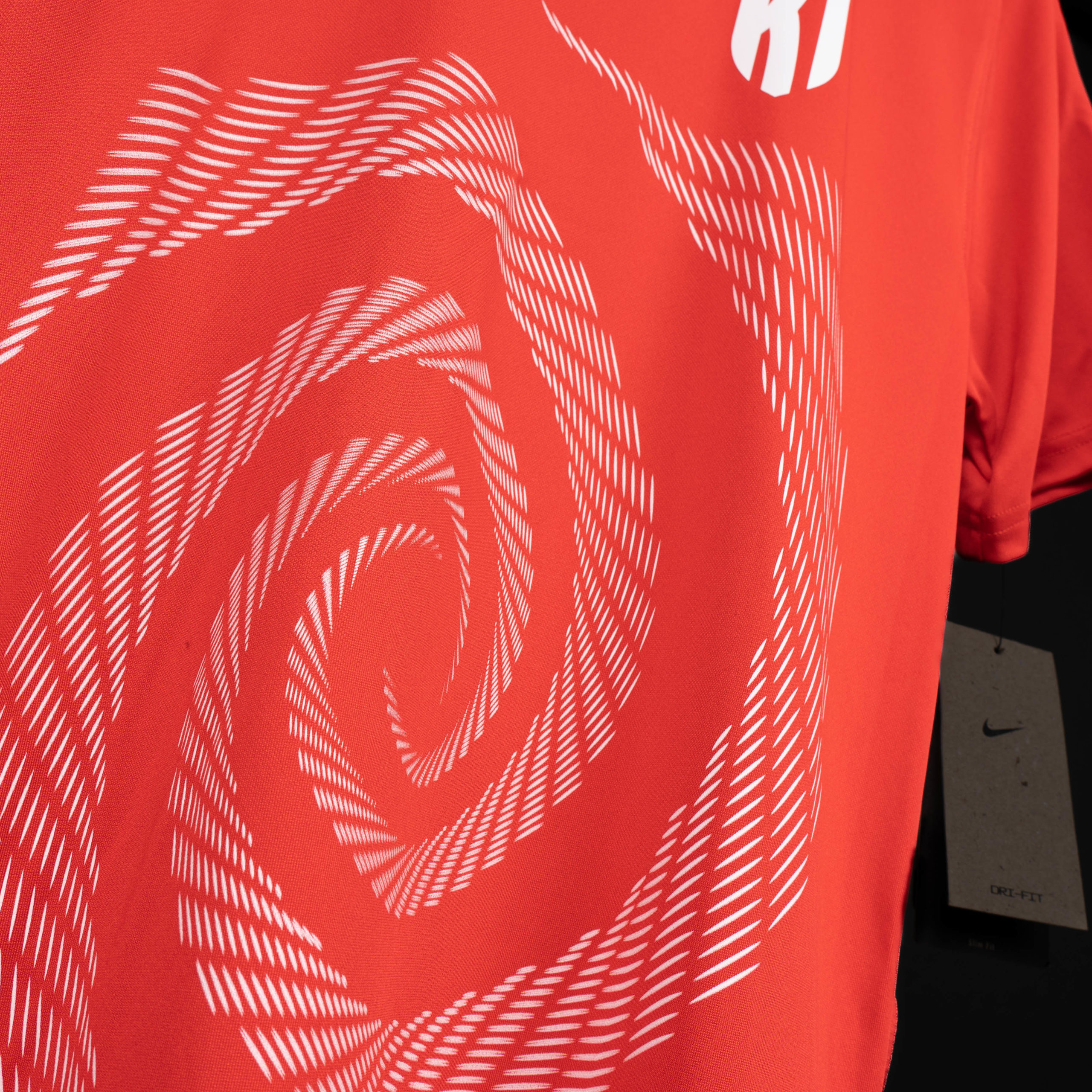
VORTEX 🌌
It’s another swirly one (technical term). This one is probably the most outlandish of the new designs, made for teams who want to take their kit to another dimension.
The Vortex design draws your eyes in like a black hole draws in unlucky space travellers. As with all our designs, it’s adaptable. So if you’ve got a sponsor, no probs.

Get in Touch & Enquire Now! 📨
If you like what you see or want to see more of our previous designs then click the link below!
And remember, if you’ve got your own vision for a completely unique design for your new kit, then we want to make it happen. Email [email protected] to get started.